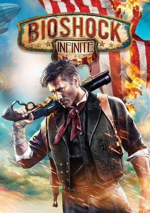
Bioshock Infinite's box art isn't for gaming enthusiasts explains Ken Levine

Proving that people can get worked up about anything, the reveal of Bioshock Infinite's box art sparked apoplectic rage among fans. Speaking to Wired , Bioshock Infinite's creative director Ken Levine admitted he knew the cover would prove unpopular with gaming enthusiasts. "I understand that some of the fans are disappointed. We expected it. I know that may be hard to hear, but let me explain the thinking."
First though, the subject of the controversy:

I know , right? Doesn't just looking at it raise the hackles? One internet poster, Jimmy Fictitious, a person I almost certainly just made up, said, "I'll be buying the game digitally, so will never actually see that cover on anything I own. But the mere fact that it's out there made me so mad that I punched a spaniel."
Levine explains that the box art is designed to appeal to non-enthusiasts. "We went and did a tour… around to a bunch of, like, frathouses and places like that. People who were gamers. Not people who read IGN. And [we] said, so, have you guys heard of BioShock? Not a single one of them had heard of it."
He then went on to make the single greatest analogy that anyone has made about anything. "Our gaming world, we sometimes forget, is so important to us, but... there are plenty of products that I buy that I don't spend a lot of time thinking about. My salad dressing. If there's a new salad dressing coming out, I would have no idea. I use salad dressing; I don't read Salad Dressing Weekly. I don't care who makes it, I don't know any of the personalities in the salad dressing business."
"I wanted the uninformed ... to pick up the box and say, okay, this looks kind of cool, let me turn it over. Oh, a flying city. Look at this girl, Elizabeth on the back. Look at that creature. And start to read about it, start to think about it."
So why do people care? The suggestion is that, despite all the claims and promises made by Irrational, the image they're putting front and centre conveys none of the themes they're talking up. It's a scowling man with a gun, raising fears that the game is more interested in mass-market pandering than providing something interesting and thought-provoking. If only there were a reassuring old phrase warning about the dangers of judging something by its box art.
The biggest gaming news, reviews and hardware deals
Keep up to date with the most important stories and the best deals, as picked by the PC Gamer team.
While surprisingly fierce, the box art outcry only registers a seven out of ten on the Storm-in-a-Teacup controversy scale as, so far, no-one has created a petition. Personally I'm entirely happy for Irrational to use mercenary tactics to sneak a game that sounds so exciting into more homes. More importantly, I am now 100% committed to meeting the personalities of the salad dressing business.

Phil has been writing for PC Gamer for nearly a decade, starting out as a freelance writer covering everything from free games to MMOs. He eventually joined full-time as a news writer, before moving to the magazine to review immersive sims, RPGs and Hitman games. Now he leads PC Gamer's UK team, but still sometimes finds the time to write about his ongoing obsessions with Destiny 2, GTA Online and Apex Legends. When he's not levelling up battle passes, he's checking out the latest tactics game or dipping back into Guild Wars 2. He's largely responsible for the whole Tub Geralt thing, but still isn't sorry.

