Dishonored concept art released with comments from art director Sebastien Mitton
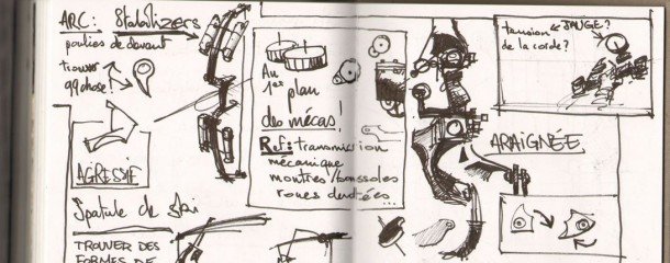
It's rare that you get a glance inside an art director's sketchbook, which makes the concept art that Bethesda sent over a bit of a treat. Each of the ten images comes with a few words from Dishonored art director, Sebastien Mitton, offering a bit of insight into the lengthy pre-production phase that locked down Dunwall's grimy aesthetic. There's even mention of a cut level set in an insane asylum. Let's take a look.
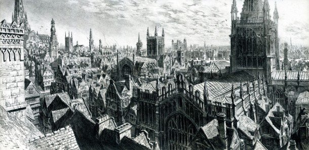
Sebastien Mitton: This is the very first pencil drawing we did when the game was set in London, in 1666. I'm a bit nostalgic when it comes to this one, but in a positive way. This is the piece of art that triggered lots of excellent work in terms of architecture - all the landmarks…there were more than 80 cathedrals in the skyline by that time. There is this very specific skeleton aspect to the facades, there is a canyon feeling in the streets, there are strong shadows.
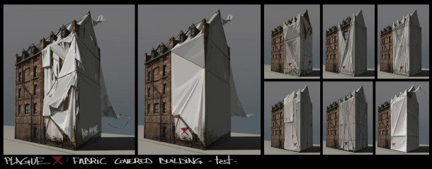
Sebastien Mitton: The plague plays an important role in our game. After many hours of research exploring narratives from the Black Plague period, we used some testimonies as a starting point for visual expression. The purpose of this exploration was to give the player a great visual impact by increasing this dystopia feeling in the city. The inspiration from this specific example (cut for gameplay consistency) came from the work of Christo and Jeanne-Claude, who mixed with the lime wash used in mass graves.
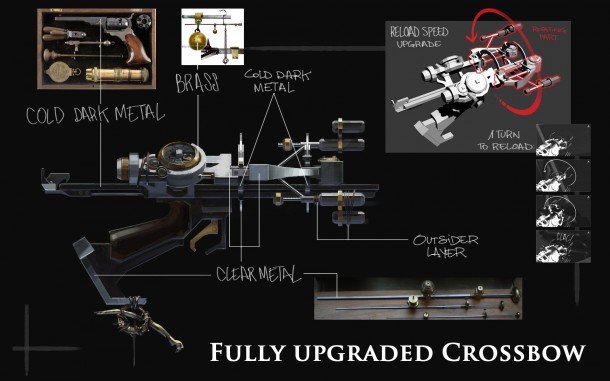
Sebastien Mitton: As a visual designer, it is a fun experience and a great challenge to align visual appeal, engineering and functionality, nice animations, and a sense of power with a handcrafted weapon that you can upgrade in different ways!
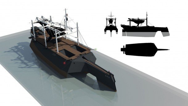
Sebastien Mitton: I really love this ship, with its moving nose that can trap whales when harpooned. The story of its inception started one day when I was visiting our office in Austin.
I noticed a guy on stilts cleaning the building façade and told Harvey (co-creative director) we could put stilts on our town crier (loud speakers replaced this guy). He agreed, and the guy instantly became a Tallboy. Then slowly, game designers modified his original purpose, and the Tallboy became a guard, armed with its bow.
I then proposed to place a canister on his back, full of phosphorus, to get nice visual effects when he shoots arrows. Harvey preferred to use whale oil. Ok, but now we need Whales right? Hard to see Whales if you don't swim in the middle of the ocean, so it was time to design a whaling ship. Here's the result!
The biggest gaming news, reviews and hardware deals
Keep up to date with the most important stories and the best deals, as picked by the PC Gamer team.
I then realized that the game universe was autonomous, no need to add anything from our real world. This world had its own needs and its own solutions as its own universe.
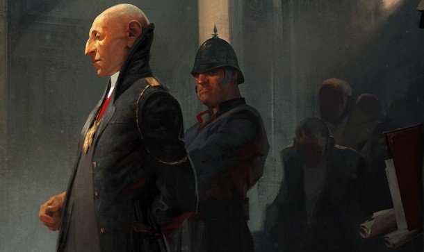
Sebastien Mitton: This one is a close-up. It's the “Regent” painting done by the artist Sergey Kolesov, who is one of the most talented painter/illustrators worldwide in my opinion. This painting won the 2012 into the pixel at E3. It has everything I love in paintings. It has that second layer of visual storytelling when you look at the bodyguard. It's not in your face at first sight, but it's there when you take the time to really look at it. It is the role of a bodyguard to stay discreet, you'd say!
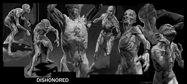
Sebastien Mitton: It is always sad when you have to cut features, ideas, concepts. But that's the nature of our role in this industry. As an artist you have to stay really agile and react positively for the sake of the project.
In this case, we had to cut a mental institution which was haunted by some locals called Lunatics. I really liked the mechanics of those non-fighting guys who are really sensitive to sounds, and who drive the player into a corner, hooting when they've detected you.
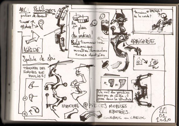
Sebastien Mitton: After a long phase of gathering really good references from museums and libraries, it's time to throw ideas on paper, and align them with the bullet points and visual filters we've decided upon.
I like this board because it shows how crazy we go sometimes during our concept session.
Jean-Luc, my assistant, not only takes notes during our brainstorms, he draws pages and pages.
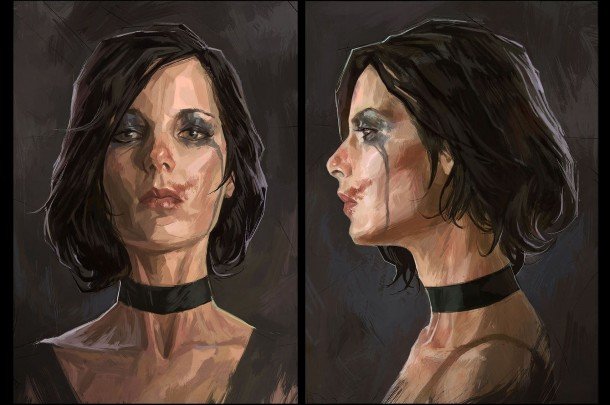
Sebastien Mitton: One of my main goals during the creation of Dishonored was to bring iconic characters to life. This girl is the result of intense research during photo trips to London and Edinburgh, analysis of mug-shots and studies of typical English traits we found in books and pulp illustration. By drawing on those known characteristics, your characters convey emotion before they talk or move. This is visual storytelling.
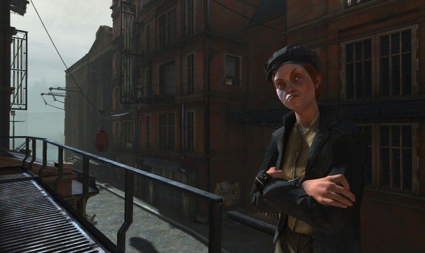
Sebastien Mitton: This screenshot shows, if not the first, at least one of the early integrations of one of our characters in game. This is a moment of joy, when you feel everything is in place. You're heading in the right direction, and you suddenly don't care about the hard days ahead.
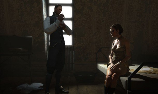
Sebastien Mitton: I talked previously about visual storytelling. Here's a perfect example of what we love at Arkane: creating a dense and visceral universe!
For more on Dishonored, listen to our Dishonored podcast special , read our Dishonored review and watch Chris' video diary in which he tries to navigate Dunwall without leaving a trace.
Part of the UK team, Tom was with PC Gamer at the very beginning of the website's launch—first as a news writer, and then as online editor until his departure in 2020. His specialties are strategy games, action RPGs, hack ‘n slash games, digital card games… basically anything that he can fit on a hard drive. His final boss form is Deckard Cain.


