How Deus Ex: Human Revolution feels on PC
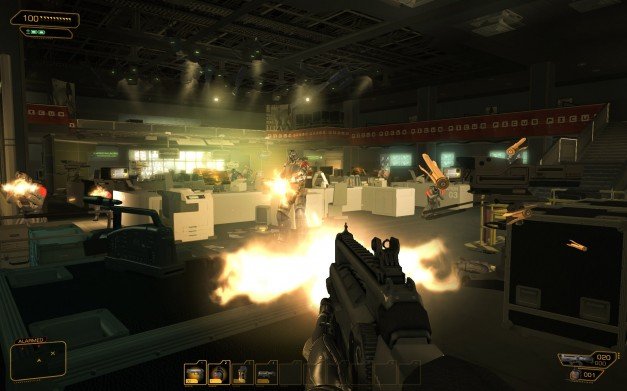
We've had the first ten hours of the PC version of Deus Ex: Human Revolution on our Steam accounts for a week or so now. We can't talk about what's in it or how good it is overall until the 11th (Wednesday next week), but we've been given special permission to talk about how it holds up on PC early. Elements of the PC port are being handled externally by Nixxes, and we've talked before about whether that's good news or bad. But now we can actually tell you how it feels.
Bearing in mind, obviously, that this is an unfinished version and polish is usually the last thing to be done:
Mouse movement
Feels a little off right now: the horizontal sensitivity is way higher than the vertical sensitivity, and there isn't an option to adjust them individually. This may be because, as the saying goes, Console Gamers Can't Look Up. Personally I got used to this after about half an hour so it's not a persistent problem, and it seems like the kind of thing they're bound to tweak. Other than that, the responsiveness is good and it doesn't have that treacly sluggishness that some console ports do.
HUD
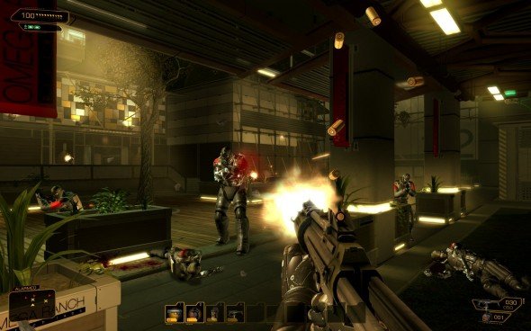
The Deus Ex 1 toolbar is back! So cool. Whatever you pick up puts itself in the next free slot on your toolbar, and you hit the appropriate number key to switch to it. You can also hover over anything in your inventory and press a number key to assign it to that slot. And like Deus Ex, there's a hotkey to toggle it if you're confident you can remember what slots you put everything in. Personally, I switched stuff around a lot and preferred to keep it on.
Object highlighting, etc
The biggest gaming news, reviews and hardware deals
Keep up to date with the most important stories and the best deals, as picked by the PC Gamer team.
On the easiest mode, the game highlights interactive objects and marks the direction of your next objective on-screen. It also shows an on-screen prompt when you're close enough to someone to do a melee takedown, telling you what to press. Thankfully, all three of these can be turned off, and they're not even on by default on Deus Ex difficulty.
Graphics options
You can toggle anti-aliasing, post-processing, V-sync and triple-buffering, and adjust anisotropic filtering and shadow quality. With anti-aliasing, it looks a lot nicer than it did when I played it on 360. But I'd like to be able to choose how much: it's still not quite enough to make it look truly smooth on my home machine.
There's also no option for texture quality. It never actually bothered me, but I have to mention that a few textures are very blurry in this build.
Inventory, map, etc
The inventory is a grid-based system just like Deus Ex. You can drag stuff about (a little laggy currently), combine it or drop it. The system can also auto-rotate an item if you only have a tall, thin space for something that's usually wide.
The map is a dynamic 3D one rather than the aerial photos of old, which is an improvement. Main objectives and sidequest objectives are marked on it, but you can toggle any of these off, and you can scroll through the floors of a building to figure out where you're going.
Like Deus Ex, it keeps a comprehensive log of all the e-books and pocket secretaries you read. And like Deus Ex, all these things are accessible as tabs along the top of whichever screen you're on: inventory, map, augs, media log, quest tracking.
Keypads, computers, etc
The game automatically stores any key codes or login details you find, then displays them on-screen when you use the keypad or terminal they work with. You type them in yourself, something I always got a nerdy thrill out of in Deus Ex 1.
Hacking is mouse driven, but this build has a bug that makes it hard to click on the right context-menu option when capturing nodes.
Performance
Runs great at 1920x1200 on my 2.8GHz quad-core Q9550, 4GB RAM, and Radeon 4800. We also tried it on our puniest machine, a dual-core E6750 with 2GB of RAM and an 8800GTS. I'd describe it as functional but not pleasant - averaging around 20fps. That rig can't run Crysis 2 at more than a slideshow even on its lowest settings, but does run Portal 2 perfectly.
The most noticeable thing on a good PC is that loading times are pretty long, even to reload a save on the same level. Performance is another thing that can change a lot towards the end of development, so I won't pretend to know how this'll compare to the final code.
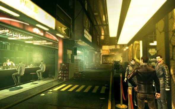
Despite these few niggles, it already feels like a PC game to me. The real test is if, once you've been playing for an hour, you still feel like you're fighting against the controls, visuals or level size. Other than the hacking bug, I don't. The game clicks, and I'm immersed.
We'll have lots more on the game itself next week, including very different accounts by three of us who've played it for more than twenty hours each. If you've been holding off getting excited, it might be time to stop.
